Wohin das Geld fließt
Follow the water, follow the money: visualization-driven articles and scrollable visualization snippets for taz about how much money is spent by the German goverment on water development projects.
Link:
Team and partners:
Eva Oer,
Luise Strothmann
Year:
2022
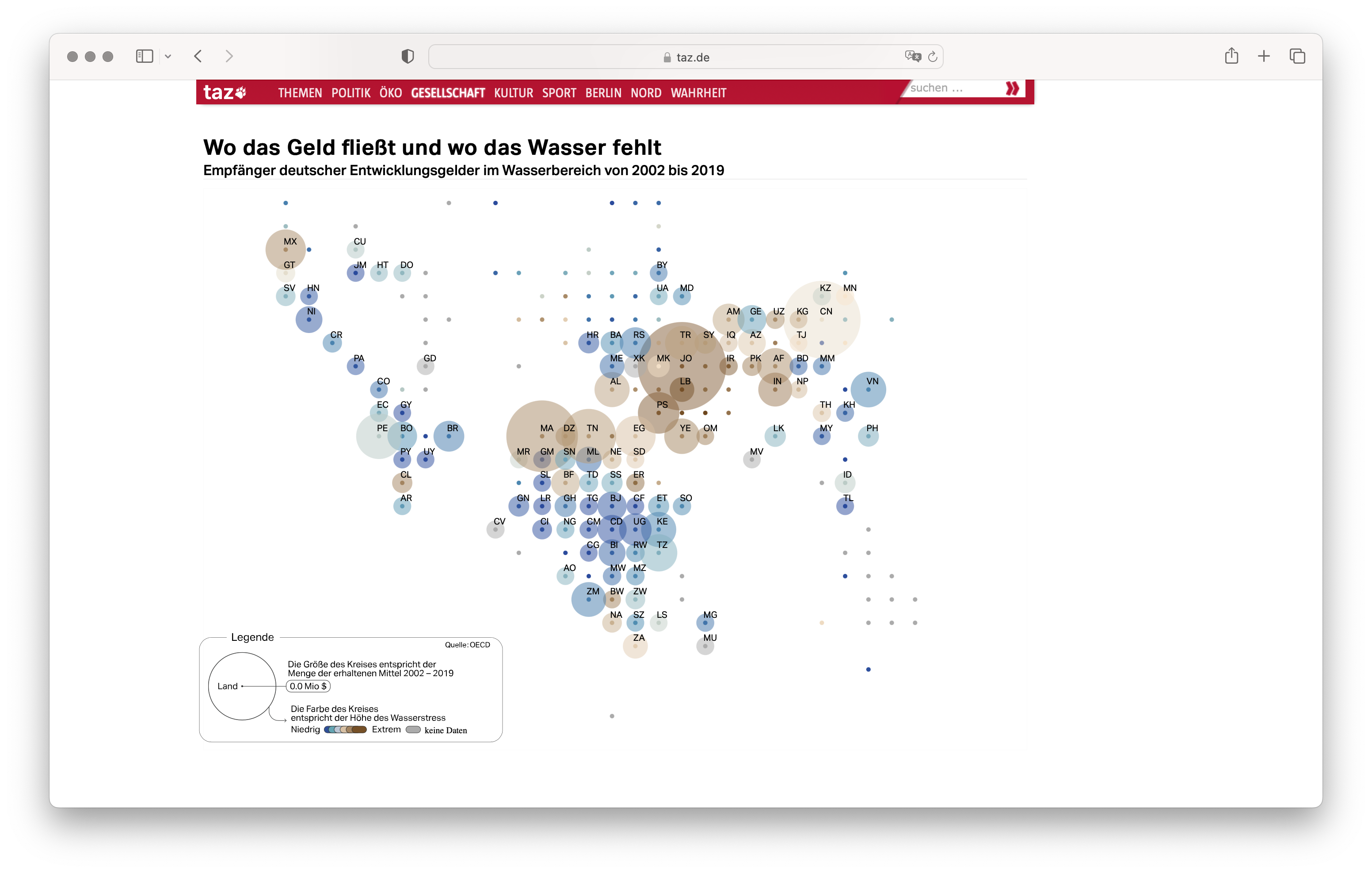
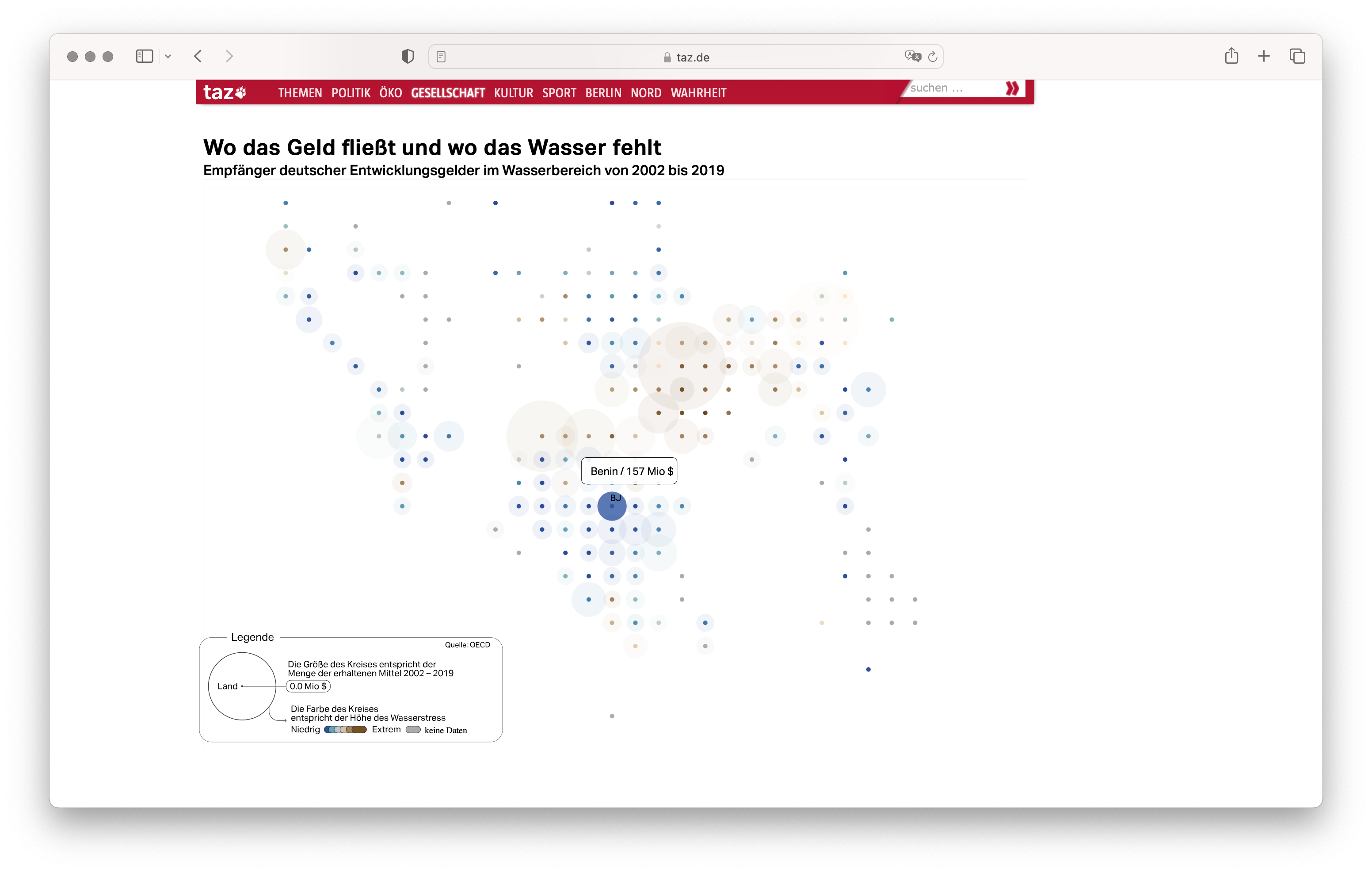
Germany is one of the biggest money donors worldwide when it comes to Water Development projects. Journalists at taz have reported in detail on where these billions of Euro are channeled. The investigation took almost one year. In this period of time I supported the journalistic team at taz in making sense of the OECD data and produce insights on where, when, and how German money were channeled and consequently spent. The final outcome is a long read, published both in the printed and digital versions of taz’s newspaper. The articles are complemented by various visualizations slicing the data at the benefit of the reader. The image below shows the main interactive visualization included in the article. The cartogram shows the reported water stress of individual countries (mapped to the color) and the amount of funds, expressed in Million $, received to stop or hinder it.
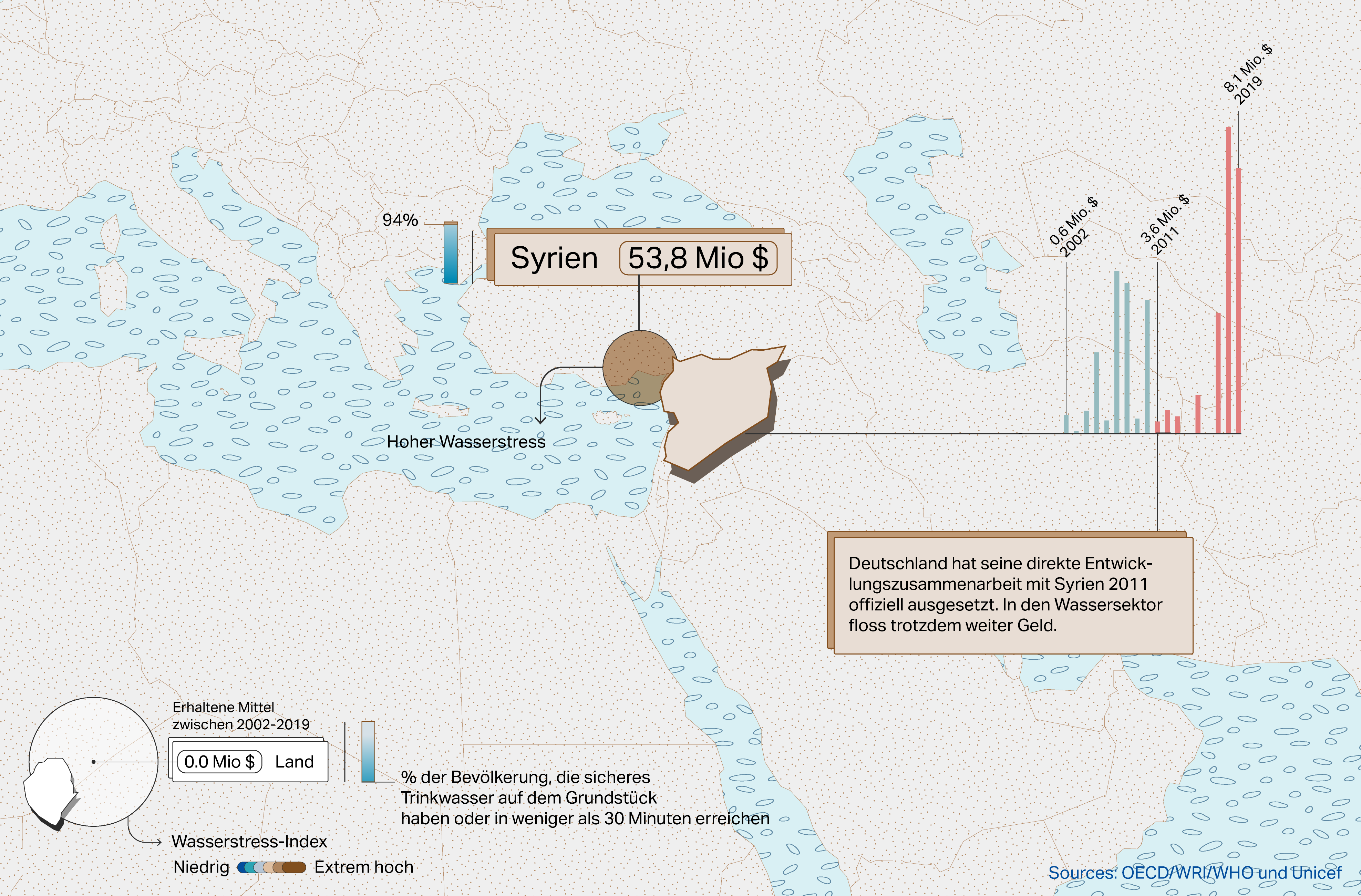
Aside from interactive visualizations, the article contains a series of maps detailing the funding and water stress situation for specific countries which were at the center of our investigation. The image below shows the example of Syria, which has been chosen due to its special relationship with Germany. The visualization shows not only the geographic position, water stress, and funding situation, but also reports an additional layer of data, showing the funding development over time.
Experimenting with small news widgets
Long reads are a popular format for data journalism pieces. Data visualizations cannot be interpreted without context and this often translates in detailed articles punctuated by interactive or static charts. This is not always ideal, especially if we need a visualization to become part of multiple articles or to be embedded in different parts of the newspaper website. For this project, I was tasked not only with the creation of static and interactive visualizations for the long read, but also with the creation of small, stand-alone charts that could be shown to the reader on the project’s landing page.
For this reason, I designed and developed a self-contained visualization carousel: by swiping or scrolling right, the reader is able to follow the unfolding of a short story about water stress. The figure below shows an early draft of the individual steps part of the scrollying carousel.
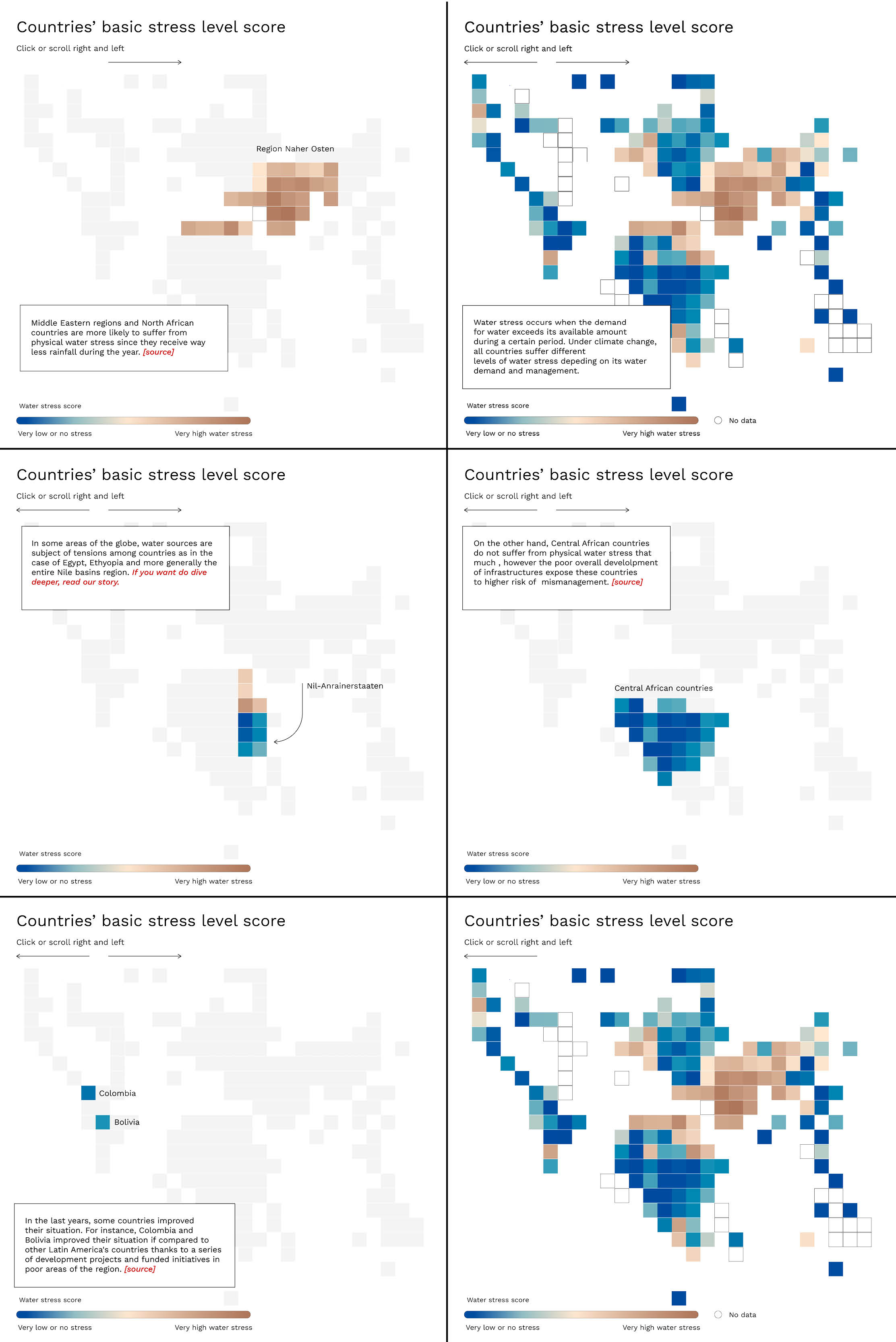
The concept is explained by showing different countries and explaining what are the implications of water stress, depending on the local climate, culture, and economy. A cartogram has been used to give equal visual weight to all countries, given the small size of the visualization. When in action, the smooth interaction allows the readers to go back and forth between the different slides and interact with the individual countries to obtain more information, as visible in the video below.
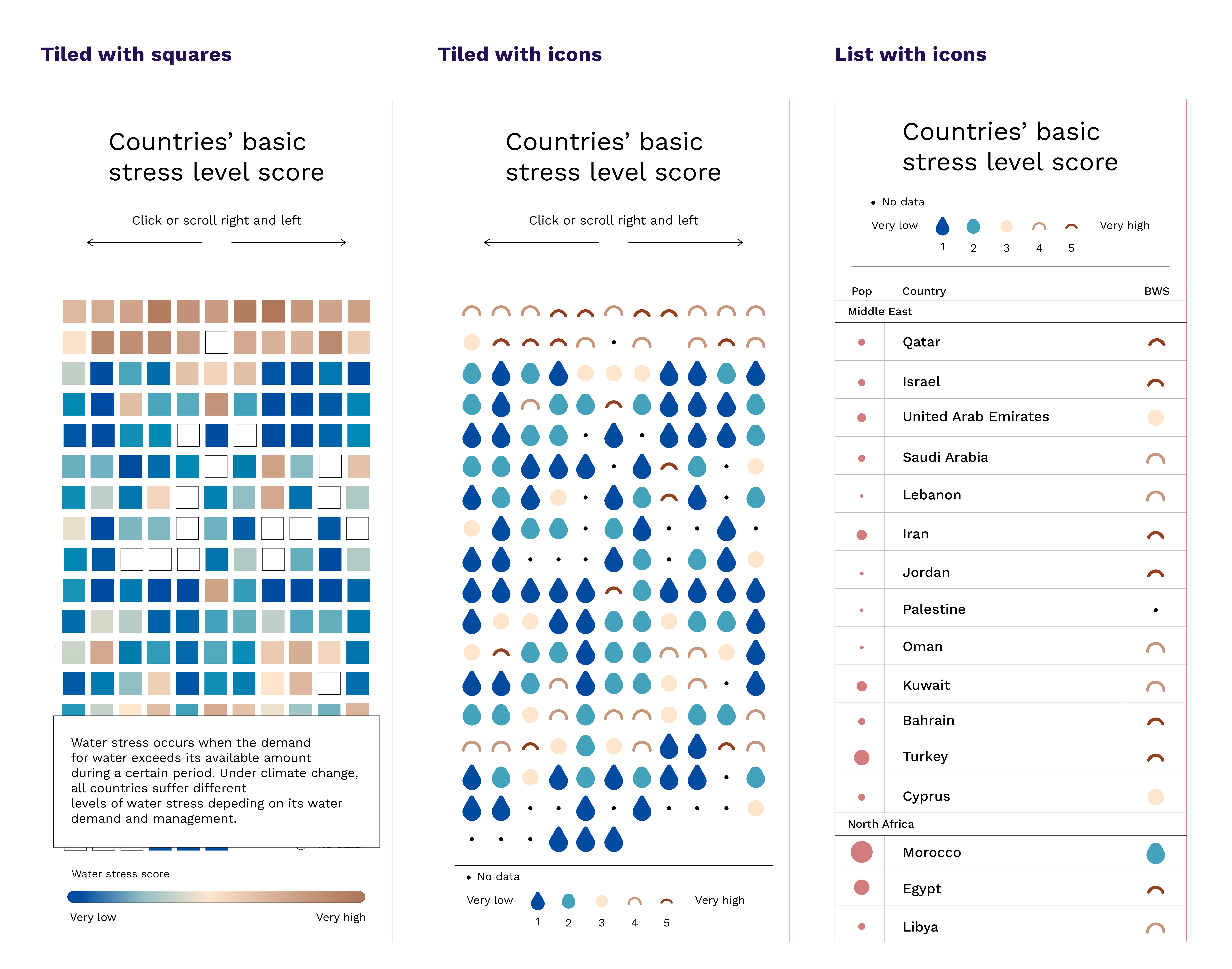
Early design and drafts for mobile version
The initial drafts for the mobile version were already quite different compared with the desktop and tablet ones. The three sketches provided below show the different phases of the design process. The cartogram gave space to a list and then successively to a grid, depicting the countries according to their geographic area and assigning different colors and glyphs depending on their reported water stress.