MVRDVHNI: The Living Archive of a Studio
Project developed for “MVRDVHNI: The Living Archive of a Studio” exhibition. The visualization arranges, on a timeline, the topics discussed by MVRDV in their documents and email exchanges, from 1990 to 2010.
Team and partners:
Giacomo Nanni
Year:
2022
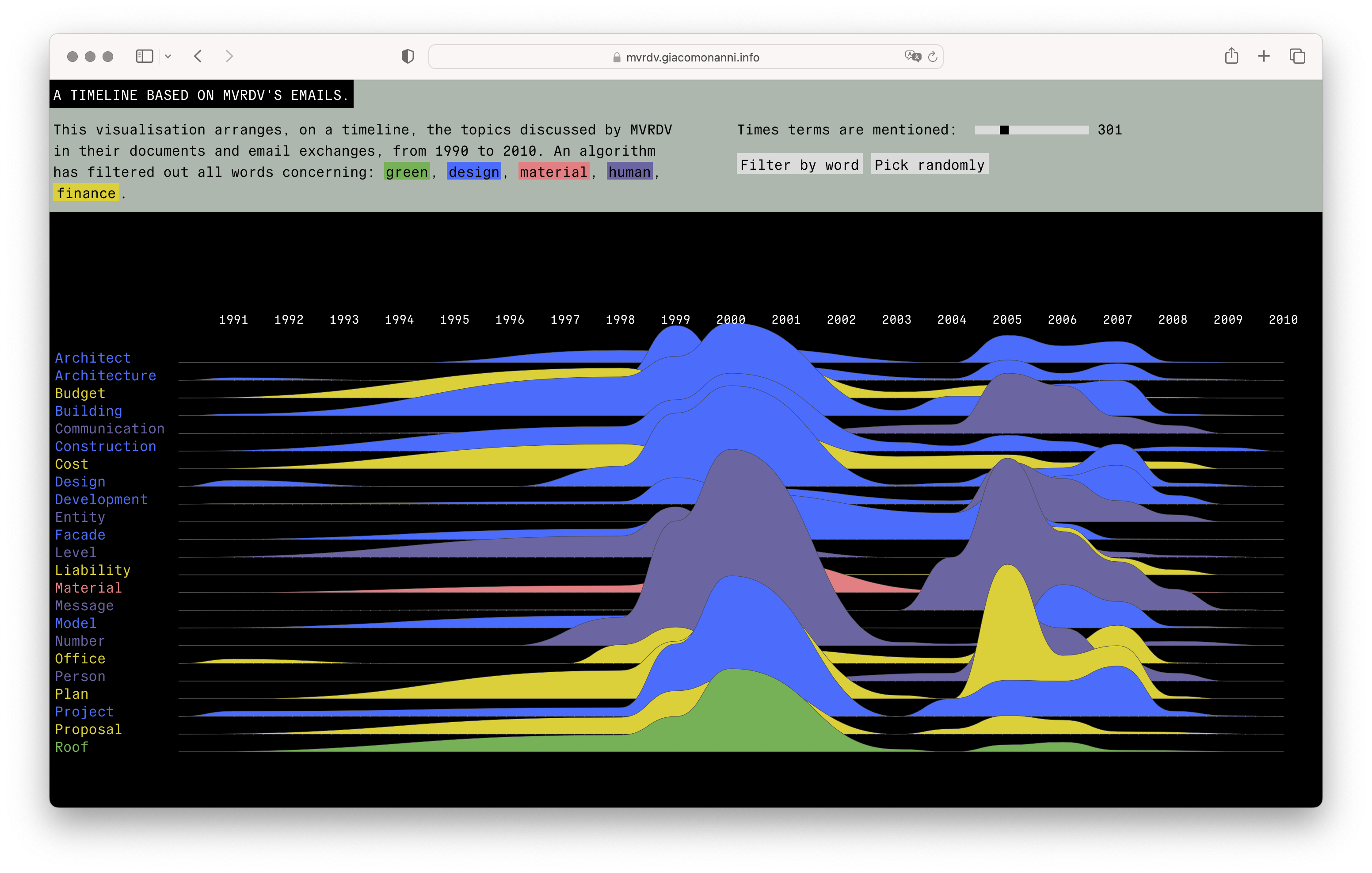
After gaining access to the MVRDV architecture studio’s archive, we decided to visualise how they talked about architecture for over 10 years. We started by collecting, cleaning and unwrapping all the e-mails between colleagues, contractors and the PR team. We extracted the relevant words that dealt with the financial, environmental or material aspects of architecture. Then we created two of visualisations that allow exploration, where users can filter relevant terms according to their category and frequency. On top of this we trained an AI using the material for PR. Visitors can feed the AI few words to draft a speculative MVRDV project. @mvrdvsht is the twitter fee where this non-sense architecture is collected.
From an archive full of emails to vis
Initially, the client approached us with an archive full of emails, press releases, and work in progress texts. No less no more: almost 30 years of email exchange between the MVRDV and its clients, contractors and partners. Emails spanned languages, formatting, and projects. Public and private: names, prices, types of wood, square meters – no piece of information was missing.
To start with such an archive is a complicated endeavor. It requires a smart and time-efficient pipeline to clean, process, and datafy all exchanges. Our objective: the key terms used in these long exchanges. To simplify the task we decided not to keep track of threads, but rather imagine the architects' conversations as a joint work of discourse: a poetic albeit pragmatic conversation about our cities. How will they look? What materials will be the most used? Who will be paid? And when?
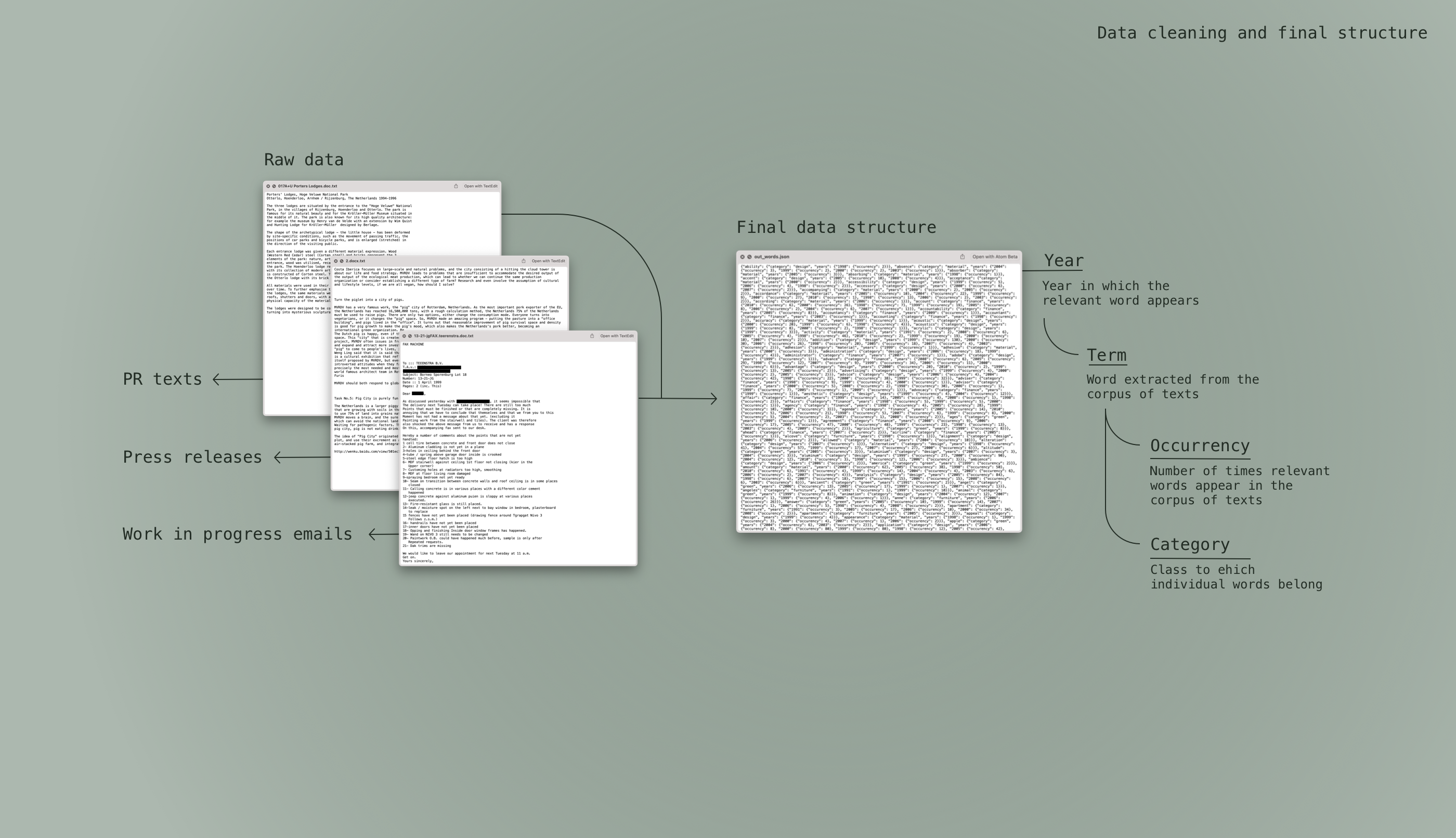
As visible in the figure above, the data cleaning pipeline brought us from the raw material to a structured dataset. The year was the most important feature. How many time over the years would one word be used? Are there words that become more popular in time? Hence the dataset includes how many time one term is used and to what category it belongs.
To determine the category we run a named-entity recognition algorithm, capable of extracting and recognizing terms, based on their meaning and belonging. We ended up with thousand of terms, ready to be visualized.
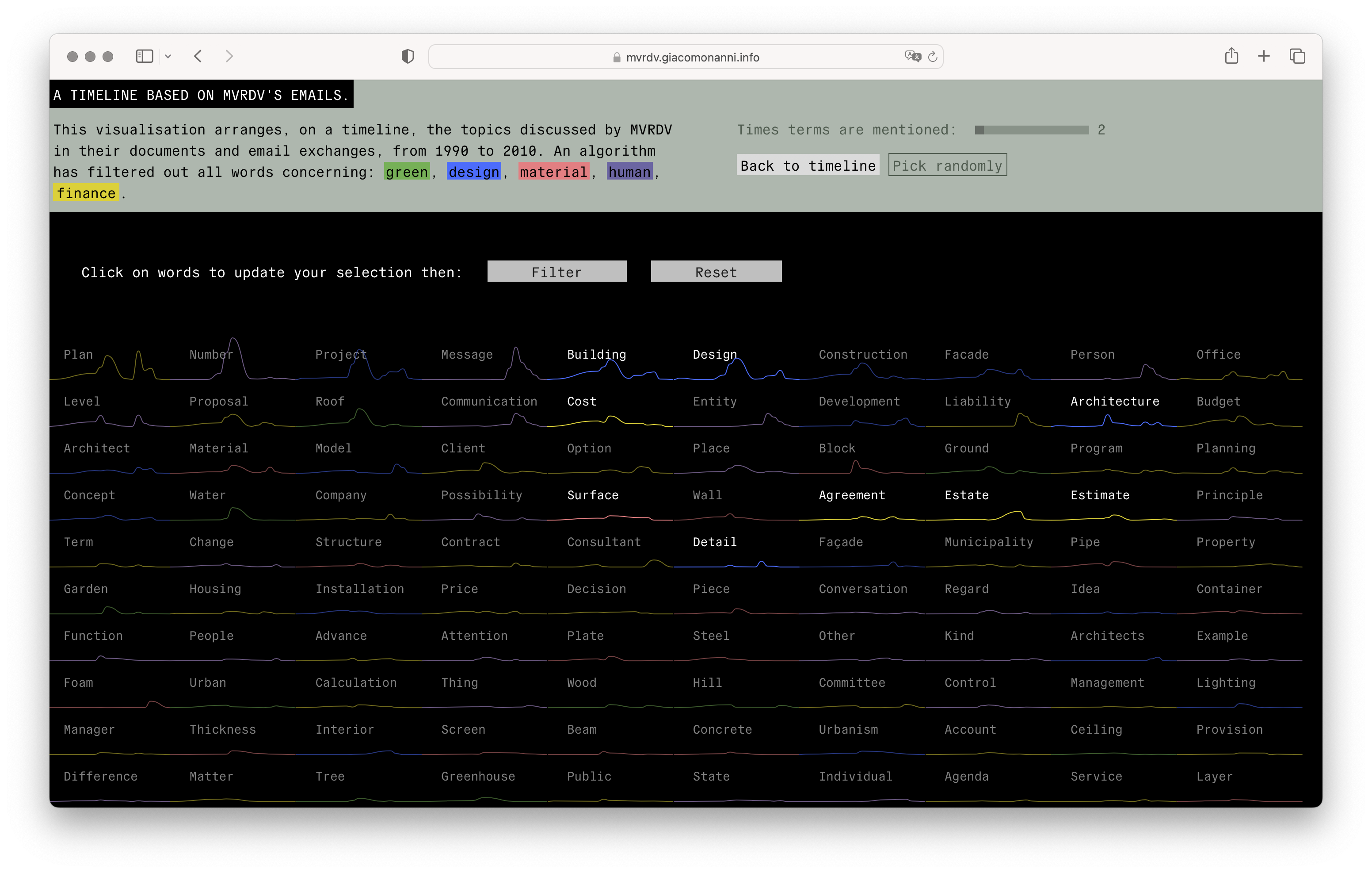
The double-visualization interface presents itself like a small toy for MVRDV founders, employees, as well as curious users. The reader can filter according to word, category or frequency. From the visualizations it is possible to see how certain words appear, disappear, and then reappear again. Technical terms, materials, but also discussions about finance and people are central to the practice from this architectural sign.